Bison Relay upgrades to version 0.19
Bison Relay 0.1.9 was released this week with a massive focus on squashing bugs, user experience improvements, paving the way for two significant new features and becoming mobile compatible.

Bison Relay 0.1.9 was released this week with a massive focus on squashing bugs, user experience improvements, paving the way for two significant new features and becoming mobile compatible.
Optimisation and speed
Let’s install the new version by heading over to Bisonrelay.org and navigating to the appropriate download for your operating system. To get the latest release, you’ll need to click on the release notes, which will take you to GitHub. Clicking on the releases link in the menu bar will take you to the latest version. Because I’m on a Mac, I’ll download the Darwin version.
Once downloaded and installed, open the software. The first thing you’ll notice is how fast the app synchronises and opens. This is due to the large array of improvements and optimisations made over the last few months.
News Feed area
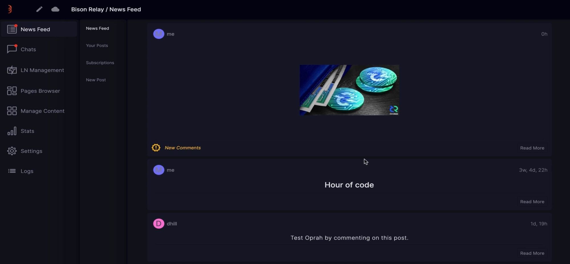
The news feed area has had a lot of user improvements. The first being the notifications, which now show as a simple red dot over the news feed and chat menus when new comments or posts are available. The news feed area now reorganises, showing the latest posts or posts with new comments at the top. On the right-hand side, there is a new date display, for each post to show when it was initially created.

Images now display on the news feed home page. Currently, these have been optimised to a small size, with an approximate width of 200px. If you click on the image, they become full screen and scale with the interface.
If we click into a post that has comments. We’ll see there have been some significant improvements with how the comments are ordered, organised, collapsable and nested to help improve the reading experience.
Chat area
One of the biggest improvements made to the chat area is all previous conversations are available after you close and reopen the software. This was a much requested feature that makes the chat a lot more useful for continued discussions.
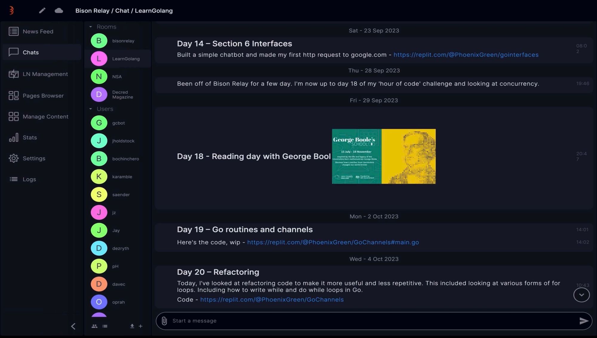
The chat area is testing out some new design features. For instance, the chat bar got a new look, which is very slick and combines multiple elements include text input, attachments, and the send button. Clicking in and out of the chat bar also has a white highlight to show it’s active when typing.

Another design feature is that, all chats are now grouped by date. There is an interesting difference between the individual chat screen and the group chat screen. Individual chats have no background, but the group chat has a grey background to highlight the date grouping. Which do you prefer?
In group chats there is also a scroll to bottom button which will be very useful to help you quickly navigate to the latest comments.
Address Book
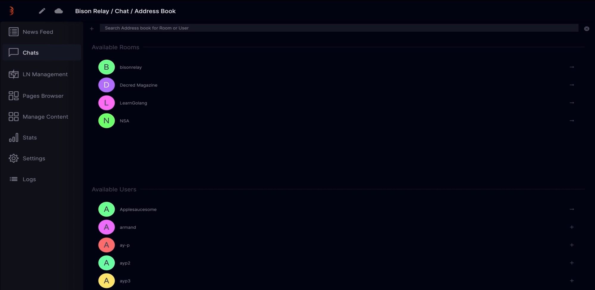
The address book was a much requested feature that allows for reducing the number of active chats in the chat sidebar. If you click on the + button at the bottom, it takes you to your address book where you’ll see a search bar, a list of contacts and available groups. If you start typing in the search bar, you’ll find the contact or group you’re looking for rapidly.

When there’s a public group available that you are not a member of, you’ll see a + button on the right-hand side, which will let you join that group. The same is also true for starting a new conversation with one of your contacts.
If you want to reduce the number of contacts in your chat sidebar, go back to the chat window. Click on a contact and select “user profile”. On this page, press, the hide chat button. This user is now removed from the sidebar, but if you head back to the address book, you’ll see them there. If you want to re-open a chat with that person, simply press the + button and the previous chat will be restored.
Another useful improvement concerning your contacts is the “unsubscribe to posts” link, in the contacts options sidebar. This will show as “subscribe to posts” when you are not subscribed to that person's news feed.
Pages Browser
As said previously, there is also a development effort to bring pages and store fronts to Bison Relay. This can be seen in the “Page Browser” area. Although this is an available tab, it’s currently not active for GUI users. The aim is to bring a whole host of user features and activities to the platform, from simple web pages to digital marketplaces.
Bison Relay Mobile
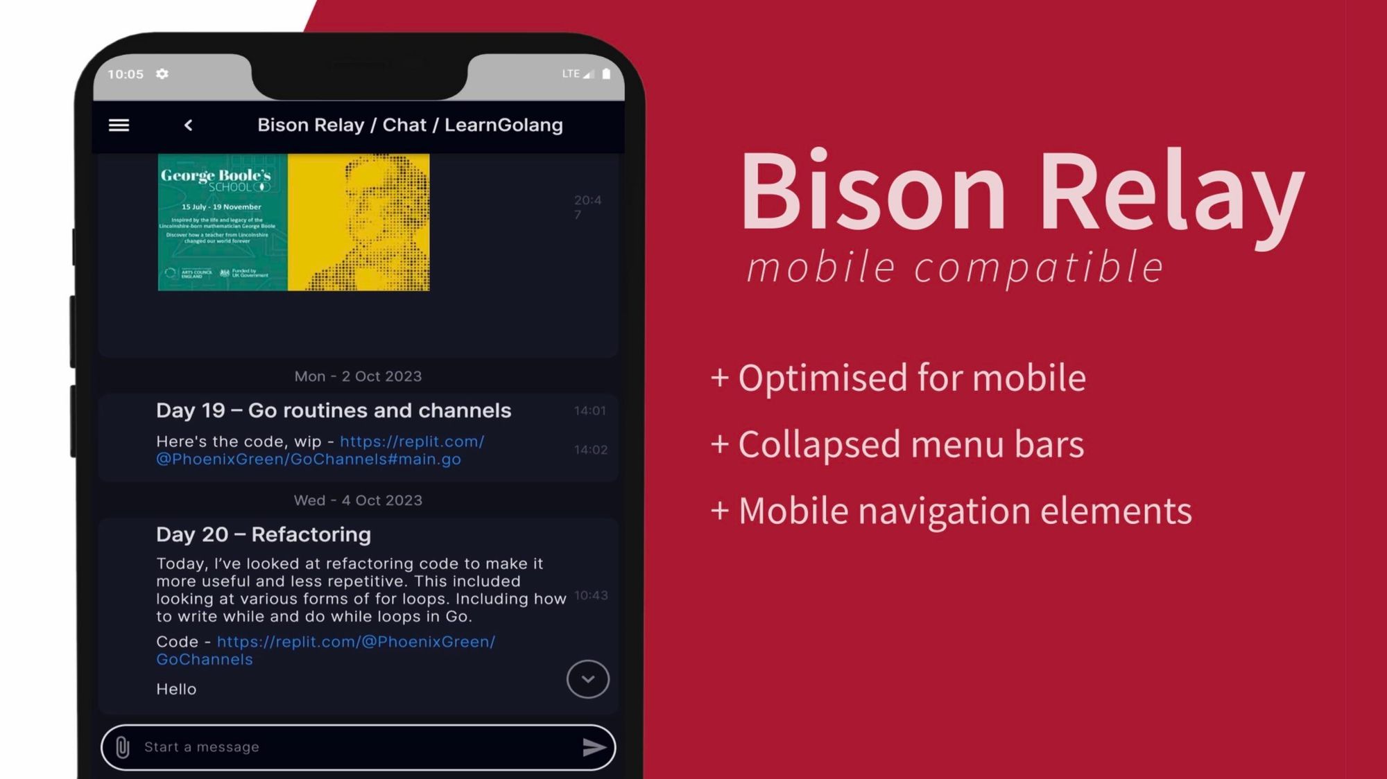
Finally, work has begun to make Bison Relay mobile compatible. By scaling the app below a certain point, it will display the mobile interface. Which includes collapsed menu bars and mobile navigation that allows the user to move between the various sections.

Even in its early stages, the mobile version of Bison Relay feels very user-friendly.
As you can see, some pretty considerable steps have been made to make this an incredibly useful and easy to use app. As we evolve to a new era of the internet, an “everything app” that preserves privacy and is censorship resistant will be extremely important. Bison Relay is building that future!


Comments ()